Settings
All nudges come with a variety of fun settings for you to play with.
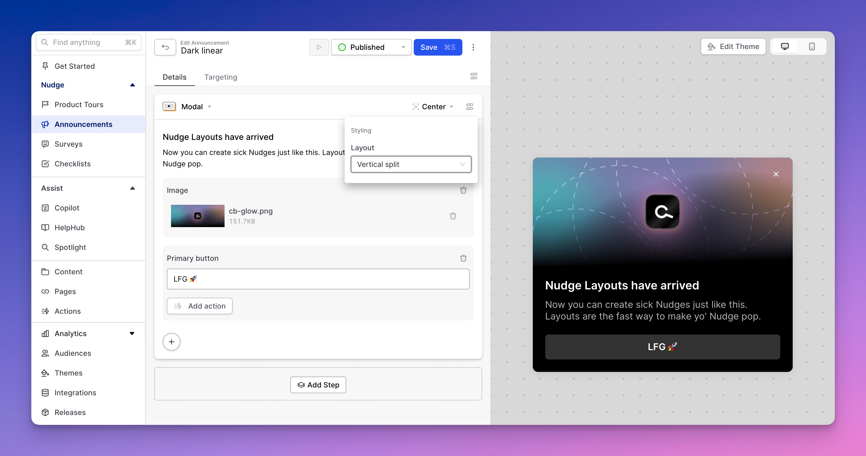
Nudge layouts
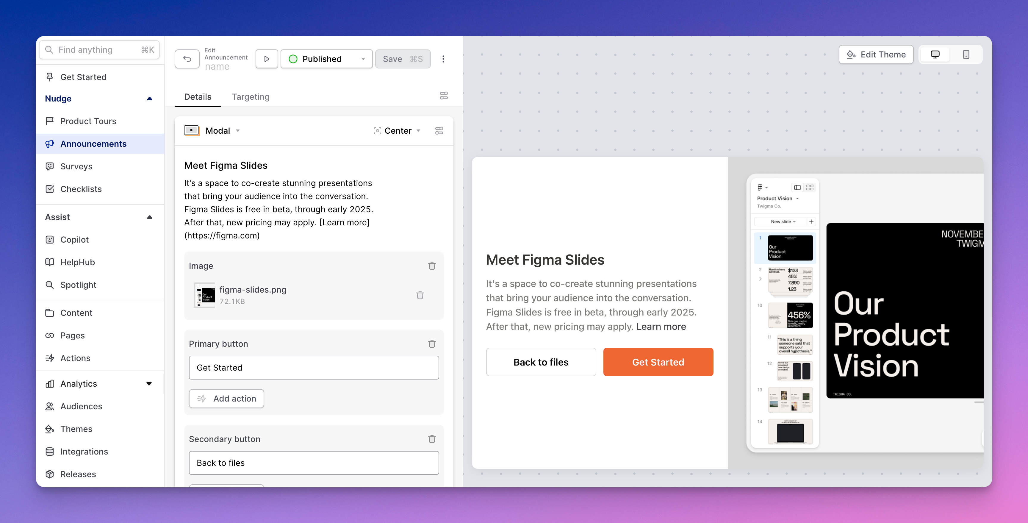
Each nudge supports our native layout options:
- Classic (text on top of image)
- Horizontal split (text and CTA beside image)

- Vertical split (image on top of text)

Dismissable
Most of your nudges should be dismissable, so this setting is on by default. When turned off, users must complete your nudge to make it disappear (or, they could just close their tab and never come back -- an option you don't want them to take!). We recommend keeping this setting on for all but the most mission-critical nudges.
Snoozable
Sometimes it just isn't the right time. Users can always discover nudges they've been shown previously in HelpHub or Spotlight. You can also give them the ability to see the nudge at a later date by enabling this setting.
Once a user chooses to snooze, the nudge will reappear in however many hours, days, or weeks you set (or whenever they next log in after the defined interval).
When enabled, you can decide whether you want the snooze affordance to appear on the first nudge step only, or on all steps.
Show step counter
Research shows that most of the time, showing users a sense of where they stand in a multi-step process makes it more likely they will complete the process (unless of course, the process is a 27-step nudge -- don't make these!).
Searchable settings
Even using all our targeting gizmos, it's hard to guess when a user is going to care about a specific nudge. You can make the task easier by allowing the user to find the nudge themselves in Spotlight and/or HelpHub search. When this setting is on, users can find the nudge in question before or after they've seen it.
Suggest in Copilot
If you're using Copilot (or have any chat in your product, human-powered or AI-powered), we're betting users ask a lot of questions about how to use your interface. Sure, you can give them a text answer (Copilot is pretty good at that), but even better is to teach them how to fish by triggering a relevant walkthrough in respone to their query. Toggling on the "Suggest in Copilot" setting makes a Nudge available for Copilot to surface up to a user in a response.
When toggling this setting on, you'll be asked to provide a CTA: this will be used in the button that Copilot makes available to the user in its response to trigger this nudge. In addition, you'll need to provide a natural language description for when Copilot should surface up this tour. Think of this in the same way you'd provide instructions to a human about when this tour might be relevant. In particular, what types of queries and keywords are a good signal this nudge is relevant?
Something like: "Show this product tour when a user asks about inviting a team member".
Custom theme
Here, you can set the theme you want to use to style the nudge. If none is selected, Command AI will default to your workspace's default theme.