Pins

Pin nudges are one of the most popular nudge form factors. You can use them for Tours, Announcements, or Surveys to attach a nudge step to a specific element of your interface. This works particularly well for tours that are designed to step through a specific sequence of interface elements or steps.
They require something other templates don’t though: an “anchor”.
What is a pin anchor?
A pin anchor represents the “thing” in your interface that pin nudges are pointing out. For example, this might be a button, link, menu item, or image.
Setting a pin anchor via the Chrome extension
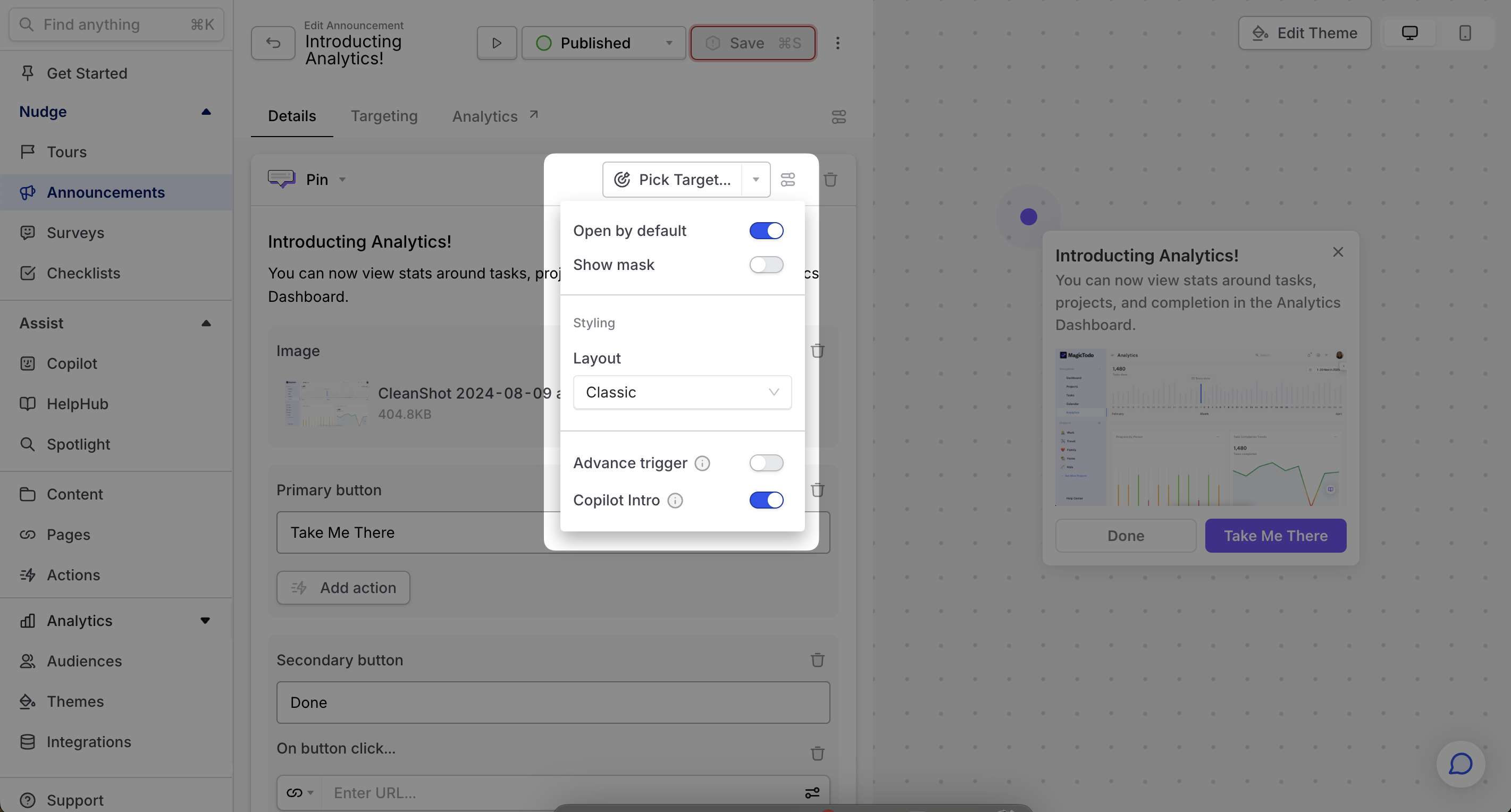
If you’re building a pin nudge in the Dashboard, you might encounter this button with a text of "Pick Target...". This button only works when you open it from the Command AI extension. Once you're there, this button will allow you to visually select the pin’s anchor: no coding required. Just hover over the element you want to pin to, and we’ll handle the rest.
Once you set the anchor, you’ll be able to preview how the pin will look in relation to the anchor. Try adjusting your screen size to make sure the pin looks good in different conditions.
If you aren’t happy with the location, you can either use a different anchor (just click “Change target”), set the anchor manually, or use the offset settings to change its position while keeping the same anchor.
Selecting a pin anchor manually
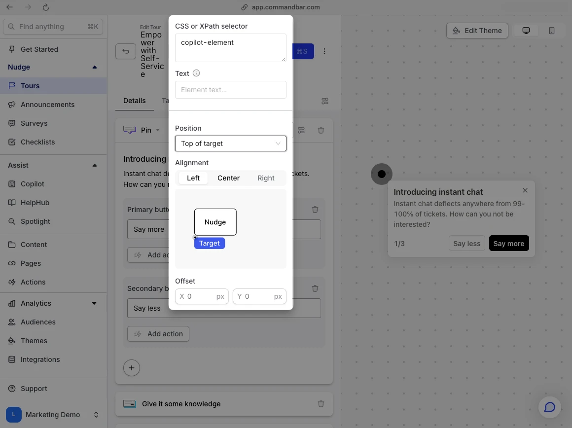
Clicking the options toggle to the right of “Change target” allows you to specify the anchor element manually. (If you’ve already selected an anchor element visually, we’ll show here the selector that Command AI came up with to target the anchor you selected).
In this field you can construct a CSS selector or XPath. Make sure you feel comfortable writing these expressions before you go this route; an incorrect anchor can cause your pin nudge to appear in a whacky place, which can make your product look janky to users.
If you whizzed past that disclaimer and thought “I’m an XPath pro”, here are some tips for writing an effective manual anchor:
- Make sure your condition refers to only one element
- Don’t use a selector that is likely to change soon (for example, using a class generated by a styling system like styled components)
- Don’t rely on user specific text that might change user-to-user
Selecting Elements within Shadow DOMs
To select an element within a shadow DOM, or even nested shadow DOMs, use a special syntax in the element selector field. You’ll write a chain of queries, each selecting a shadow-root parent and then the final target element, formatted within square brackets.
For example: [#root-shadow-dom, #nested-shadow-dom, #target].
Using Chrome Devtools Generated Queries
You can also use queries generated directly by Chrome Devtools for pinpoint accuracy. Simply right-click an element on the page, select "Inspect", then right-click the highlighted element in the Devtools and choose "Copy JS path". Paste this path into the element selector field. This method is compatible with both regular elements and those within shadow DOMs.
Offset settings
Whether you’ve set your anchor visually or manually, you can specify an X/Y coordinate offset that slightly adjusts the position of your pinned nudge and its beacon. This is useful when fine-tuning the pin position; for example, you could make the pin appear slightly to the side of an element.
Open by default
If you create a pin nudge for the first step of a multistep nudge sequence, you have the option whether to show the full body of the nudge by default, or just the beacon. By default, we’ll show the whole nudge. Turning off this setting can allow you to build “hotspot-style” nudges that call the user’s attention to part of your UI, but allow them to opt into the full experience by clicking on the beacon before they see any text.
We are a fan of these hotspot nudges because they don’t visually overwhelm the user. You can even place multiple hotspots on a single page!

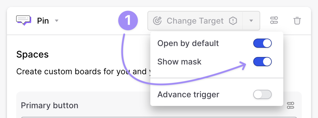
Show mask
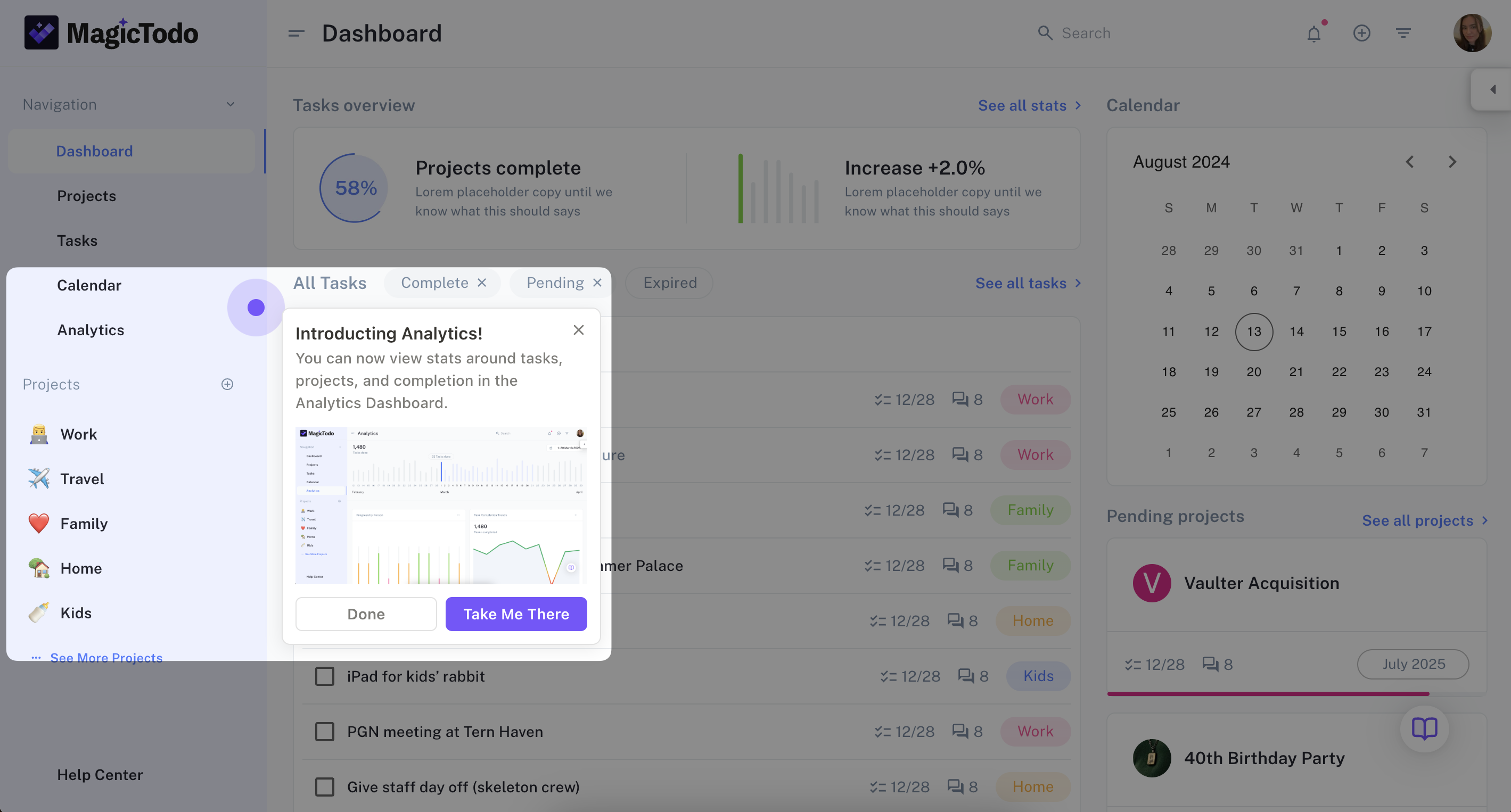
Occasionally, you want to ensure that a nudge is truly SEEN before doing anything else. In that case, you can use Show mask to darken the background behind a pin nudge. These can be great when used on steps 2+ of a multistep nudge to focus attention but could be too interruptive for the first step.

Advance trigger
There are a number of situations where you might not want the user to click on the pin itself to advance the tour. For example, you might be using the pin to point out a button, and you want the user to click on the button (simulating what you hope they will do in the future) rather than clicking a "Next" button in the nudge itself. If this setting is on, then clicking on the pin itself will act as a signal to advance the tour (or complete it if it has no remaining steps). This can be combined with an advance button.
Aligning pins and nudges
When you place a pin, Command AI by default will place the nudge corresponding to it at an angle that we think maximizes readability. However, you may want to control the nudge position relative to the pin. To do this, You can select from a set of options: top, bottom, left, and right. You can further refine the nudge position after selecting a pre-set. For example, if you select "Bottom of target" you can specify whether you want the nudge to be aligned to the left, right, or center of the bottom edge. Or manually add an X/Y offset if you're really finnicky.
The position options are: Top of Target, Bottom of Target, Left of Target, Right of Target.
- The alignment options for Top and Bottom of Target are: Left, Center, Right.
- The alignment options for Left and Right of Target are: Top, Center, Bottom.
