Years ago, you could get away with bad UX: People didn't have alternatives and it was expensive to switch. Most software was hard to use because it simply didn't matter. Now, user friction can be a huge cause of churn, and if not handled properly can tank your SaaS product.
Don't have time to read this full awesome article? Here's a quick highlight reel:
Key Takeaways:
- There are three types of user friction: accidental, structural, and emotional.
- Session recording, user analytics, and usability testing tools can help you uncover the sources of each friction type.
- Investing in QA, simplifying flows and using standard UI patterns, and leveraging in-app guidance can help identify and reduce user friction while improving user experiences.
Sound easy? The devil is in the detail. Let's dive in...
You’ve likely experienced user friction already yourself.
What is user friction?
User friction is anything that hinders a user from achieving an outcome on your digital product. Common examples of user friction are an un-intuitive user interface and critical bugs/errors.
In the early 2000s, user friction was rampant but expected given that the internet was still pretty new. Web 1.0’s friction was defined by slow connections and lo-fi control interfaces. But today, friction is a product of user interface overload. Technologies like Ajax and React have enabled web apps to deliver richer, but more complex interfaces. With complexity comes a new breed of user friction.
The Causes of User Friction
There are three types of user friction—accidental, structural, and emotional.
Accidental friction is typically the engineering team’s department—bugs and errors that aren’t intended to happen and often prevent a user journey from achieving an outcome. Accidental friction is tackled by (a) surfacing bugs that users are experiencing and (b) deploying patches in an efficient, expedited manner. Bugs and errors may be obvious (error alerts popping up on the user) or more discreet (a product not being responsive to certain screen sizes).
And then there’s structural friction. Unlike accidental friction, structural friction is more invisible. Structure friction happens when either:
- A user struggles to understand your product
- A user fears that your product will be hard to learn
- A user believes too many steps are needed to accomplish a task
- A user feels a product is slow to respond
- A user feels an action behaved differently from what it should’ve
In other words, structural friction is user frustration at an otherwise ideally-functioning product. We can break structural friction down into three more categories.
- Interaction Friction—if a user struggles with anything above while actively interacting with your product, that’s interaction friction. This is arguably the worst type of friction because users feel that your product is badly-designed / low-value.
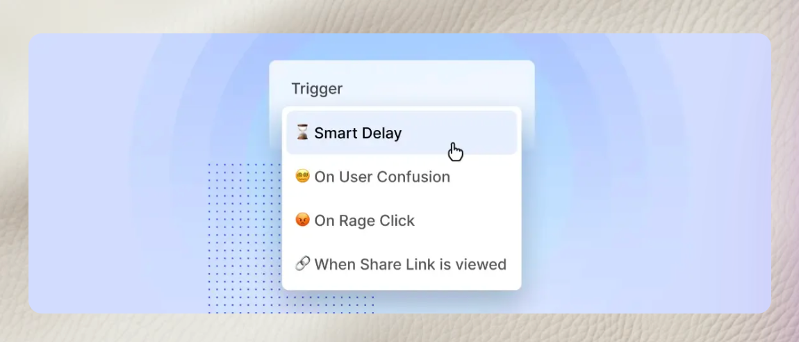
It used to be hard to capture this friction, but now with smart triggers in our product like rage click or frustration, you can see when users have this behavior and then serve them up with feedback forms or help!
- Cognitive Friction—if a user believes that they need to expend a lot of mental energy to use your product, that’s cognitive friction. Unlike interaction friction, cognitive friction may stump users at the beginning of their user journey.
Common examples of cognitive friction include:
— A user feeling that a product’s terminology is different from their own, which increases cognitive load.
— A user feeling like a product’s utility is overshadowed by the energy to learn its interface.
— A user feeling like a desired outcome on your product takes too much cognitive load, concentration, and/or too many clicks.
- Emotional Friction—emotional friction happens when a user experiences either cognitive friction or interaction friction and develops a negative attitude about your product. Emotional friction may be witnessed in internal messages between employees angry with a tool or task. Even if a product solves the user's root problems, emotional friction can hinder them from giving a product a second shot.
Why Care about User Friction?
There are plenty of products that users complain about but still buy and use. The most popular is likely Salesforce. Most sales professionals believe Salesforce is a powerful but unintuitive tool, but given Salesforce’s ecosystem, wouldn’t consider using anything else. In rare cases, friction may be perceived as a good thing. For instance, users may appreciate friction when utilizing a banking app because it implies better security.
However, most products are not afforded this friction-agnostic luxury. Today’s app marketplace is highly competitive, and products with high user friction will have fewer conversions from free/trial accounts to paid, especially when relying on a product-led growth strategy. Products with high user friction will suffer worse product adoption and feature adoption, thus feature a worse retention rate.
Without tackling user friction head-on with a product adoption process, you will frustrate users and your product will not reach its full potential.
Metrics to Measure User Friction
The Metrics
Before we can tackle user friction, we need to understand where it is happening by detecting user friction and its sources. There are a number of techniques you should implement to determine where user friction exists in your product.
- User Flows—imagine each session that a user embarks on as a journey. Like any journey, there is a mission to be accomplished. First, decide if you can understand the user’s mission. Sometimes, this is easy—perhaps they clicked on “New Ticket” and, therefore, are on a mission to create a ticket. Other times, tricky—imagine a user that flounders around a product with no clear sign of what they want.
For a user journey where the mission is clear, then measure if they were able to accomplish it. For the earlier example of creating a ticket, a user needs to actually reach the end of that flow to accomplish their goal. If that drops off early, there’s a good chance that that region is a source of friction.
Of course, some users may abandon your product for reasons outside your control. Perhaps they received a funny text and got distracted, or maybe their toddler started screaming from across the house. With any product, there are going to be befuddling user journeys that cannot be explained because you weren’t there. That’s okay. What matters are trends and repetitive examples of user journeys that are interrupted at the same points.
- Time-to-outcome (TtO). Determine an ideal time it should take for a user to achieve an outcome by either sampling your best user’s journeys or your employees. Then examine how long it takes for the average user to accomplish an outcome. Stay clear of the worst users—they are likely distracted by matters outside your control or don’t need your product. Instead, focus on the users that are successful but slow. Examine how much time they spend per step and cross-examine that with your best users. Using this method should reliably identify user friction.
- Unexpected User Flows. Sometimes, users may do things completely irrational to a product-educated viewer. For instance—why did they start a ticket, abandon the flow, make a comment, then start a new ticket without revisiting their old draft? Alternatively—why did they attempt to create a template from the documents tab and delete it afterward? Sometimes, unexpected user flows happen because a user is fickle about what they want to do. However, unexpected user flows may happen because a user is confused about how a product works.
- Unexpected user flows typically happen when a user is invested in utilizing a product, but a product’s interface doesn’t efficiently reveal how they accomplish that action.
- Lack of Usage. A user may not log into your product as often as they should. Perhaps they have the capacity to, but the perceived friction of using your product encourages users to procrastinate returning back.
The Measurement Tools
There are fundamentally two major techniques to measure the aforementioned metrics and identify user friction or spot user frustration signals.
- Event-Based Journeys. Using a platform like Amplitude, Posthog, or Mixpanel, define events in your product. Each event has an associated user and session ID, and your analytics solution will be able to re-create user flows.
- Event-based journeys are a fantastic way to gauge user flow funnels. For instance, you can measure how many users that began a journey successfully completed it and at which stage users dropped off at.
- Session Recording. Around 2014, session recording became an alternative option to event-based journeys due to the advent of the MutationObserver API. With the MutationObserver API, session recording efficiently records and reconstructs a user’s precise journey, including which buttons they clicked, which elements they hovered over, and what they saw on their screen.
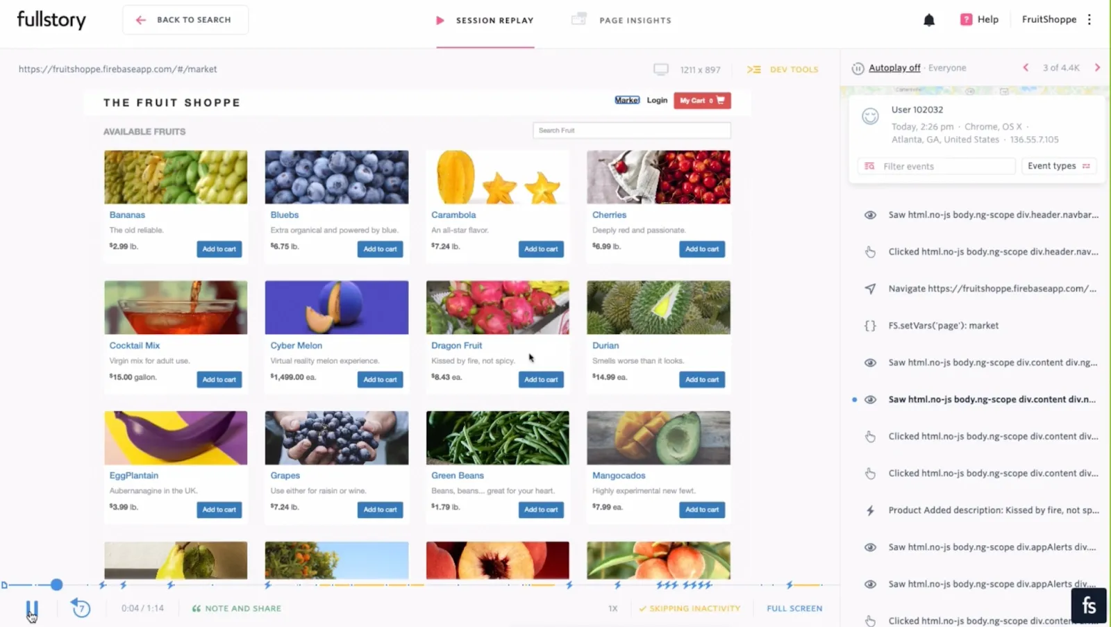
The most popular session recording tool is FullStory, but other platforms like Posthog, Hotjar, LogRocket, and Highlight are gaining popularity.
Session recording is rarely successful without event-based journeys being recorded. Otherwise, your product designers will be unable to reliably find and aggregate findings on session recordings without an event-based journey database to triage through.
Techniques to Minimize User Friction
While some user friction issues may require a more bespoke, specific solution, there are common techniques used to minimize user friction. These techniques vary between accidental and structural friction, so I’ve split the following into two lists.
For Accidental Friction, friction via unintended bugs:
- Invest in Quality Assurance. Via usability testing, catch bugs before they go live, minimizing unhappy users that hit snags. You can build a strong Quality Assurance process by hiring quality assurance testers or building out unit tests that must pass before a product is deployed. Many businesses use both of these techniques to minimize the likelihood of bugs. At Command AI, we have invested in QA engineering earlier than most companies; we felt that the investment was justified given our product embeds into our customers’ products and therefore is held to a high-quality standard. This investment has paid off massively.
- Install an Engagement OS tool. Tools like Intercom and Drift enable disgruntled, stuck users to seamlessly reach out to your team to report a bug. You can think of these tools as user-initiated user interviews. While not all users will take advantage of such a service, this real-time form of user research will dramatically improve bug reports.
- Invest in a Bug-Focused Session Recording tool. Products like Sentry or LogRocket alert your engineers when a new error is surfaced on production and make replaying the relevant session seamless. A session recording tool is a way for your engineers to hit “rewind” and discover the root cause of a snag.
- Improve Product Performance. Invest in an edge-based solution like Netlify or Fly.io to surface your app faster, implement caching techniques to minimize load times, and utilize techniques like socket connections to improve app reactivity. All of these require a sizable technical lift, so while they’ll pay enormous dividends, may rob your engineering team of time that may be scant.
- Use a Browser Emulator to Test. Use a browser emulator like Chrome Devtools or BrowserStack to test your product in uncommon screen sizes and browsers that your engineers may not routinely use. This will help surface bugs that happen on a specific device more quickly.
- Mobile Emulators. If your product has active mobile usage, hire a team to test your product on mobile devices using actual touch screens and screen keyboards. This may catch snags not available in an emulator as touch events are different.
- User Testing. Of course, tools can help, but sometimes there's no substitute for running navigation and usability testing sessions with users directly. Watching users interact with your product, or conducting in depth user interviews will help you oncover and reduce user friction, putting you on the path to optimal user experience.
For Structural Friction, friction via invisible hindrances when using your product
- Condense Flows. Remove steps to decrease user fatigue to accomplish an action. However, condensing flows may lead to user confusion if they are presented with too many tasks at the same time. If you are going to condense flows, actively monitor if your revised flow is confusing users.
- Simplify Complex User Interface Components. Users likely spend far less time on your product than all other platforms combined. When Sergio Nouvel declared that Web Design is Dead, he was arguing that websites need to put more effort into imitating familiar UIs than innovating on them. While certain common modals (selectors, taggers, checkboxes, etc.) may feel un-innovative, boring, and perhaps even inefficient, they are often the correct decision to minimize user friction.
For Emotional Friction
- Inform the User More. Sometimes, your product needs time to query a database or process a request. Use animated spinners or loading bars—even if slightly fictitious—to assuage the user of the idea of a broken product. Users are less likely to be frustrated at a platform if they feel like something is happening in the background.
- Build a Community. By engaging your users in community Discords or forums, you’ll encourage users to be more forgiving of a work-in-progress product. Given all products are constantly improving, fostering this community is invaluable when things invariably break.
How Command AI can help you tackle User Friction
You may be wondering why we’re so passionate about reducing user friction at Command AI.
Command AI dramatically reduces user friction by improving your end-product experiences and supercharging your user's ability to interact smoothly with your product. This includes nudges like product tours, checklists, or in-app messages, which are unintrusive, triggered at the right time, and in context. It also includes our user assistant, Copilot, which allows users to get quick answers to questions and even have experiences like product tours or co-browsing launch from the Copilot. Altogether, this makes it easier to reduce all levels of friction. You can identify issues with features through microsurveys. You can get insight into cognitive and emotional friction through user intent and more.
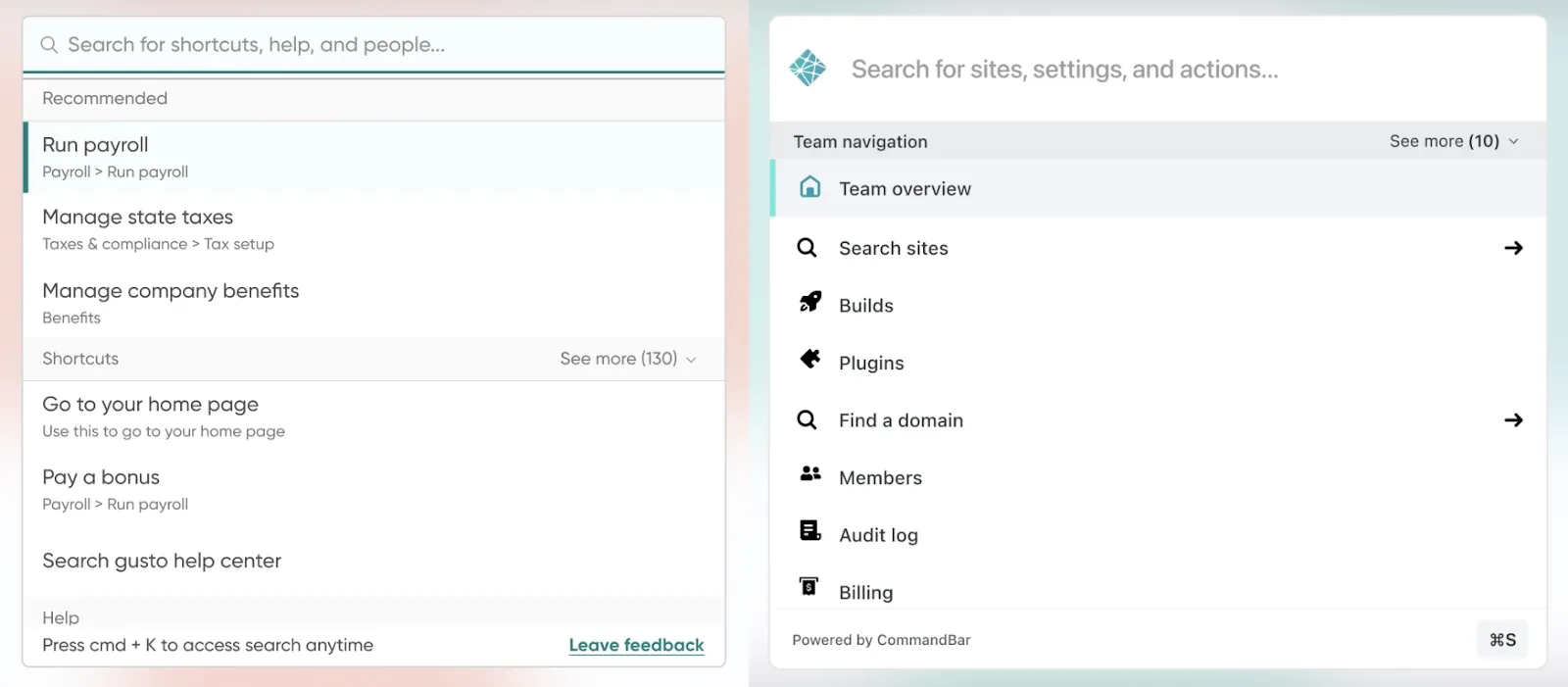
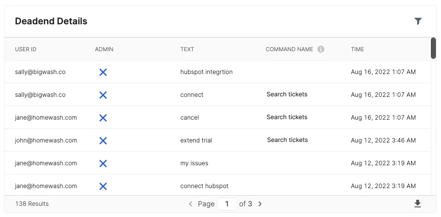
Using Command AI, you can make complex and hidden patterns easy to locate and utilize. Additionally, you can make surfacing help content distraction-free, minimizing user confusion. While Command AI cannot help with accidental friction, it can dramatically minimize structural friction and with our dead-ends feature, inform root causes of structural friction.
Conclusion
Eliminating user friction is one of the biggest challenges in user experience UX design. As products grow more and more competitive with each passing year, ensuring your product has frictionless UX is critical for long-term success. Keeping on top of all types of user friction and reducing user friction is essential. If you want to learn more, check out these examples of user onboarding.
