Almost every product manager and designer has built an experience map at some point in their career. It's such a foundational part of mapping users' interactions with your product that it is considered a cornerstone of product development.
However, most SaaS companies use customer experience maps incorrectly, based on our experience. They think of them as an upfront investment that helps map the initial development of their product for your core user persona. Perhaps they even refresh them every six months or a year or add a new layer if a major new cohort of users joins.
At risk of sounding alarmist, that's a recipe for disaster. Building these customer experience maps is meant to clarify what different types of users experience. However, when infrequently updated, they risk doing the exact opposite - squashing together personas whose questions, jobs-to-be-done, and experience levels differ (in a way that should be reflected in their product experience).
The best way to prevent this: gather copious amounts of user intent data (we’ll talk about how later) and update your experience maps frequently, at least once a quarter.
What is a user experience map?
Before we dive into how to better use and update your experience map, let’s quickly review their core utility and purpose.
An experience map is a comprehensive visual representation of your user's entire interaction with your SaaS product. This means more than just technical charts of your onboarding flow or core user flows. An experience map brings the users’ emotions and reactions, as well as their actions and intentions. For example, check out Spotify’s music-sharing experience map:
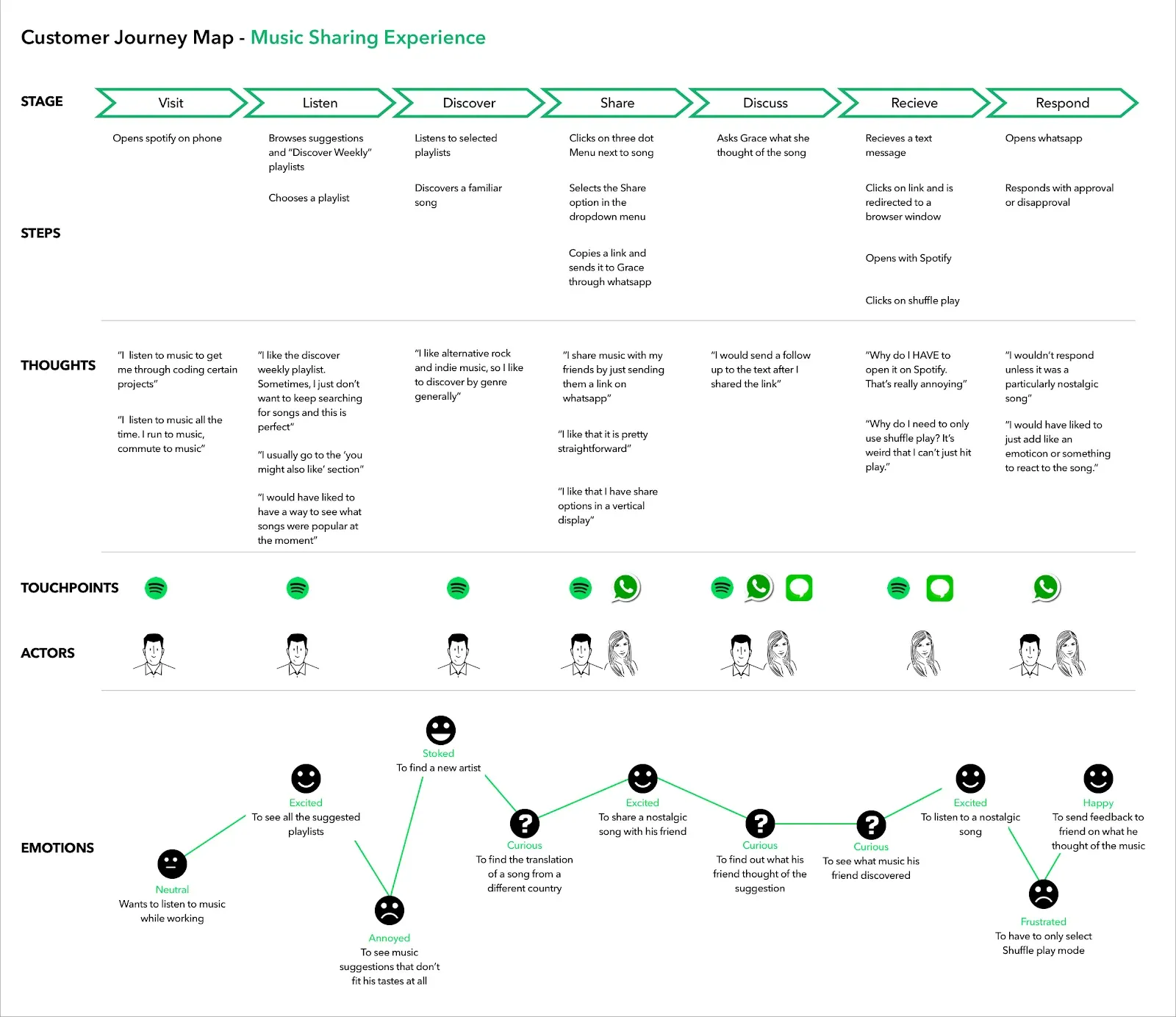
As you can see, this is not a If A then B, if not then C → D, etc. flow chart. It’s got a lot more life to it — it’s much more user-focused than that.
Experience maps help you consider what your users think, feel, and do as they interact with your product, not just the stages or pages that they go through in the product.
Making a user experience map that actually works
It's easy to pound an iced coffee, fire up Figma, create some flow charts and labels, and call it a day when it comes to building your experience map. But the reality is that building a great experience map that will not just be a static relic in your Notion workspace or Google Drive but rather a living, breathing, and evolving document that truly captures your user experience is very hard!
It takes two things
- A great initial build-out founded on a deep understanding of your users
- The desire and ability to reassess and refresh your maps based on new information about users.
Building a great user experience map
Creating a detailed initial user experience map requires several core characteristics.
Understanding your users and building accurate personas
It'll be no surprise to hear me say that understanding your users is key to building accurate personas — no shit.
But what does that actually mean?
Do deep customer research, talk to folks, and build a comprehensive understanding of what they're trying to do with your product. Then, run that by not just your fellow leaders but also customer support, sales, marketing, engineering, your product team, and everyone else. Gather input, collect feedback, and implement it into these user personas until you are assured that you truly know what you're talking about.
Documenting your product stages
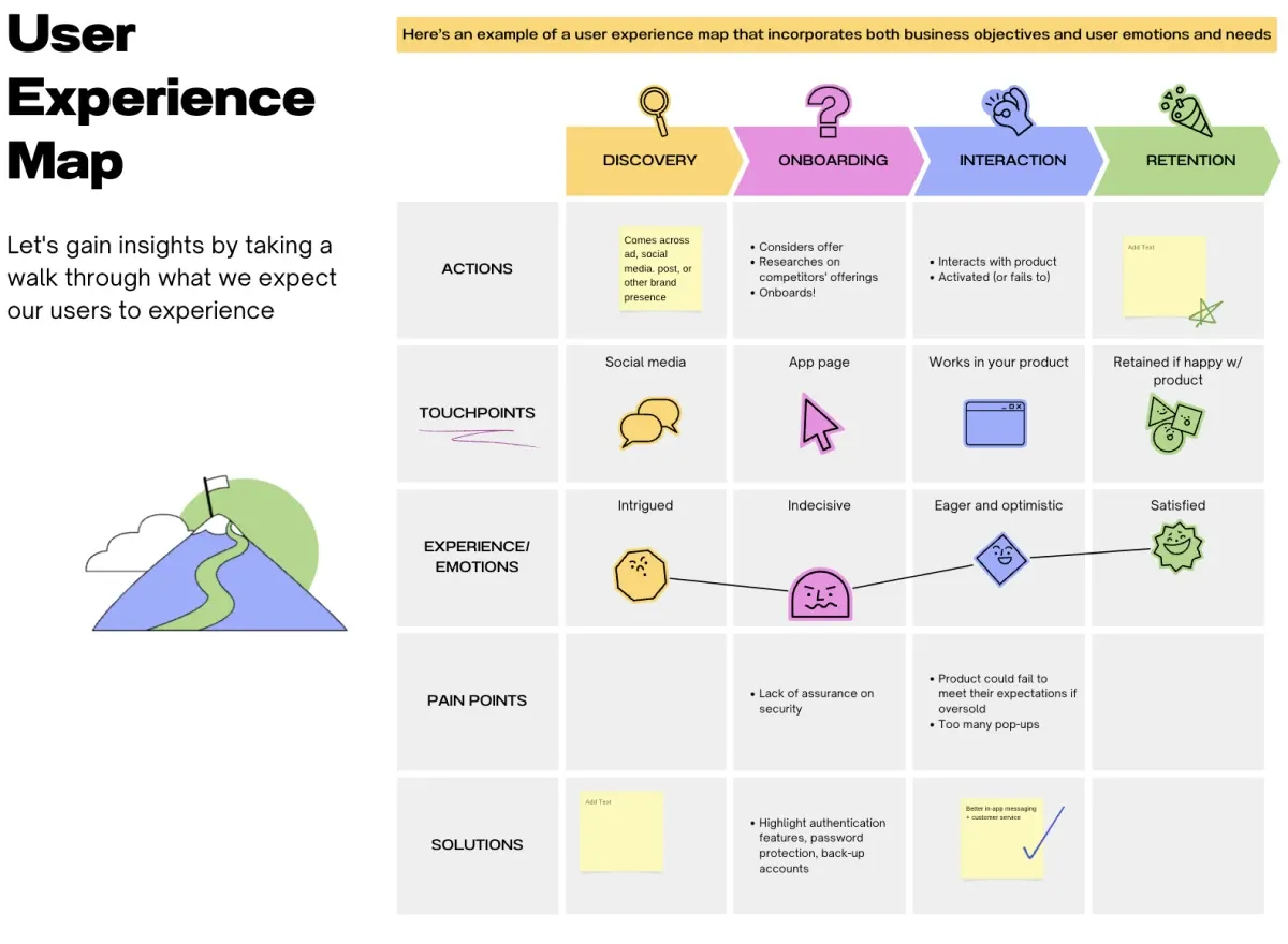
Like a budding relationship between you and a new lover, your users' relationship with your product will go through different stages. Generally, users will flow from Discovery → Onboarding → Adoption + interaction → retention or churn.
Obviously, this is inherently simplified, but that's the point. I won't sit here on a pedestal and be prescriptive about how you should build your experience map, that would be wrong and counter intuitive to the whole point of the experience process itself.
But I will say that careful and detailed documentation of every stage your user will go through is key to a comprehensive user experience map.
Scroll back up to the Spotify example, and you'll see that they have almost 10 stages for simply sharing a piece of music. Now imagine a more complicated B2B enterprise experience map!
Don't be scared of the potential size or breath of your experience map, that's part of the point of the document.
Emotions, thoughts, and feelings
Let’s get touchy-feely for a bit 🥰
You have to remember that your users are not a monolith. On any given day, you can have different personas in different attitudes and places with different goals hitting the same flow. Sounds like a nightmare for an experience map? Well, kind of.
The reality is that even the best user experience map is inherently a fairly binary and linear document that doesn't truly capture the breadth of experience for users in your app unless you're a one-flow tool. We'll talk about this more later.
For now, though, the best way to build an effective experience map is to consider and gauge the most likely emotions and outcomes at each stage for your core user persona. Sure, something that lights 90% of users up might be off-putting to 10%, but for your initial experience map, you can safely use your primary emotion.
Pro tip: Remember to document not only the positive feelings that will come from this flow but also potential negative reactions or friction points. Sure, it might be less pleasant to talk with your team upfront about these issues, but the reality is that inevitably they will come up, and it is better to be aligned on a potential response earlier rather than later.
The issue with SaaS user experience maps (and how to fix it)
The brutal truth about experience maps is that you could read this blog and 10 others like it, 20 YouTube videos, pay a consultant, and produce a beautiful, well documented and detailed experience map based on great research, user interviews, and data, and guess what:
Absolutely none of it will add long-term value if you don’t update it and refine it based on true user intent, and optimize it as your product and user base grows and evolves.
Most experience maps are too linear and account for one-size-fits-all user experiences. That’s just their nature.
Listen, build it for your most important persona initially, absolutely.
But you must recognize that there is a long tail of user personas and jobs-to-be-done that won’t match.
How do you solve this?
Through user assistance.
Solving for the perfect user experience map (or at least getting close!)
User assistance tools and experiences let users explain what they’re trying to do in their own words. This is the clearest “intent” you’ll ever have: it’s in the users’ own language, right there in front of you. Then, you can use this intent data to assess whether you have any large, unmapped personas/journeys and consider mapping those as you continue to grow.
In real life, an example of this are the “deadends” that users generate via our Copilot product (natural language user assistant). Folks set it up and have it ingest all of their docs, help information, product tips, and more. Users begin to ask questions and get answers, and as the days go by, you build up this massively valuable repository of natural language user intent insights.
Imagine a user asks “how do I turn on dark mode”. And then you see lots of users asking about similar things. Well you know that dark mode matters to some users, and you can go backwards from there to figure out which users care about dark mode, and where are these users in their journey.
You suddenly have this body of evidence that you can use to update and improve your user experience map and consider when to create new ones.
What are folks actually searching for? When do they get worried or frustrated? When do they give 5/5 feedback and find things very simple and easy?
All of this user intent data is disgustingly valuable; it’s truly been a game-changer for folks, and we’re stoked to be able to provide it.
Conclusion
I want to make clear that experience maps still have a ton of value even when you don’t necessarily immediately start with all of the user intent data. But, they become a valuable ongoing UX decision asset when you create a system that takes in user intent data, converts it into product insight, and updates your roadmap and technical development priorities regularly (monthly, quarterly, etc.)
When you bring together the comprehensive nature of the experience map with the highly granular user intent data, you create a more tailored and targeted mental model of your product and its flows, and consequently, an even stronger actual product and, most importantly, happier users.
Experience Maps Challenges, Best Practices, and FAQ
Creating and utilizing experience maps for SaaS products involves navigating through a set of challenges, primarily centered around data collection, interpretation, and the actionable implementation of insights. Addressing these challenges effectively is key to maximizing the benefits of experience maps. Here's a look at some common obstacles and best practices for overcoming them.
Challenges
Data collection: Gathering comprehensive and accurate data to inform your experience map can be daunting. SaaS platforms often have vast amounts of user interaction data, but filtering this data to find meaningful insights can be overwhelming. Additionally, qualitative data, such as user feedback and emotions, can be harder to quantify and incorporate.
Data interpretation: Even with ample data, interpreting it correctly to draw actionable insights is another challenge. Misinterpretation can lead to misguided strategies that do not effectively address user needs or pain points.
Staying up-to-date: User expectations and behaviors change over time, as do SaaS offerings. An experience map that was accurate a year ago may no longer reflect the current user journey, making continuous updates a necessity.
Alignment Across Teams: Ensuring that different teams within an organization (such as product development, marketing, and customer service) align their efforts based on the experience map can be challenging. Each team might have different priorities, making it difficult to implement a cohesive strategy that improves the user experience.
Best Practices
Leverage Mixed Methods for Data Collection: Combine quantitative data (analytics, usage metrics) with qualitative insights (user interviews, surveys, feedback) to create a more comprehensive picture of the user experience. This approach ensures that both the "what" and the "why" behind user behaviors are understood.
Engage Cross-Functional Teams: Involve stakeholders from different departments in the creation and utilization of the experience map. This ensures buy-in from all relevant parts of the organization and helps align strategies across different teams.
Iterate and Update Regularly: Treat your experience map as a living document. Regularly review and update it to reflect new findings, changes in user behavior, or shifts in your product or market. This ensures that the map remains relevant and useful over time.
Focus on Actionable Insights: When interpreting data, prioritize insights that can lead to actionable improvements in the user experience. Clearly define how each insight can be translated into specific changes or enhancements in your product or service.
Use Visuals Effectively: A well-designed experience map should be easy to understand at a glance. Use clear visuals and avoid overcrowding the map with too much information. Highlight key insights, pain points, and opportunities in a way that's accessible to everyone in the organization.
Validate with Users: Whenever possible, validate your experience map findings with real users. This could be through testing changes based on the map's insights or directly seeking user feedback on the accuracy of the journey and emotions you've mapped out.
Training and Education: Educate your team on how to interpret and use the experience map. Workshops or training sessions can be helpful in ensuring that everyone understands the map's components and how to apply them in their work.
