In theory, product-led growth attracts customers without a sales team. Like a well-oiled machine, it entices free users with a free trial and then seduces them into a paid plan.
In practice, product-led growth often attracts tire kickers without intent to buy. It stuffs your database with users who seem to measure their productivity in support tickets submitted to you.
That’s not because PLG doesn’t work. It does. But free-to-paid conversion (the percentage of user signups who become paying customers) is hard. And, as the example of Equals shows, product-led growth can harm startps.
If you master it, you get new customers 24/7. If you don’t, you amass a graveyard of email addresses that skyrocket your SaaS bills.
While free-to-paid conversion is hard, you can increase it with the proven tactics we share here. In this guide, you’ll discover how to convert more free sign-ups to paying customers.
Before we start: Is free-to-paid the right metric?
Free-to-paid conversion is one of the most important metrics for product-led SaaS companies. But it’s not a simple metric because it’s related to so many others:
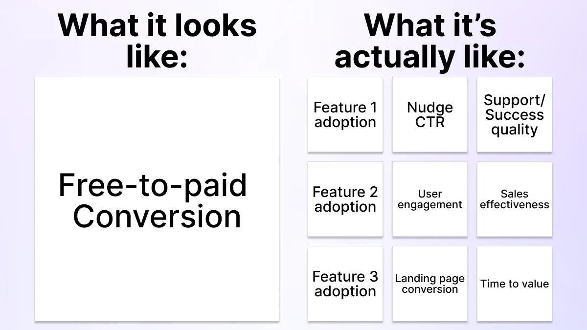
Free-to-paid-conversion is a lagging indicator of how happy users are with your product. That means it’s part of a complex system with many factors that all influence each other. Compare that to landing page conversion: You can add testimonials to your site and measure the difference quickly.
Free-to-paid conversion is harder because it includes so many factors. But they all boil down to how well you fulfill your users’ jobs to be done. You have multiple tools to influence these, including tools like Command AI, your team and your product itself.
That’s why it’s important to align your team on the fundamentals of your product—the user journey.
Know why users should upgrade (and when)
Marketing wants users to enter their credit card information immediately. Users don’t. That’s why so many PLG motions fail: Marketers/Product teams not considering the user’s perspective.
In pure-play (read: no-sales) PLG, users dictate the when, why and how of upgrades. That’s why your user experience needs to stir a desire to upgrade. That doesn’t happen if you sprinkle pop-ups into your dashboard until your product feels like a billboard.
You can’t increase your free-to-paid conversion unless you understand the user journeys that lead to the upgrade. If you don’t know when users love your product the most, you don’t know when to prompt them for an upgrade.
This requires a deep understanding of your product and its use cases. If possible, collaborate with multiple parts of your company on your PLG motion. For each, we’ll share an example of how we do this at Command AI:
- Sales/Success: If you have a sales team, ask them what makes prospects’ eyes light up on demos. Those could be good points to place prompt an upgrade. Here at Command AI, our GTM team sees how Copilot automatically syncs help docs. Sales & success also usually know best which questions & objections customers and prospects have, as well as which part of our product makes their eyes light up.
- Data: Dive into the data to see when current customers upgraded. Those could be indicators when future users are ready to upgrade. An example of this for Command AI is that we only offer upgrades when Command AI has been installed and live. Users who don’t take those steps don’t get asked to upgrade.
- Marketing: Your marketing team knows which messaging is most likely to resonate. But squeezing all your messaging into pop-ups aren’t the answer. They frustrate users and want to use apps that don’t interrupt them. Marketing is perhaps the most obvious contributor. At Command AI, we make sure our social media audience understands our product from our marketing. That way, they’re familiar with the product once they sign up.
- Support: Bring in customer support to find out the most common questions people ask. That way, you can make sure your product doesn’t leave questions unanswered. For every support ticket sent, there are multiple users who just stopped engaging. That’s why we often escalate support requests and make them visible to the whole team.
Note: Bringing other teams into the fold can create conflicts of interest. Marketing wants to litter your product with upgrade prompts, sales might want a permanent “schedule a demo” button. This leads to a problem we call Air Traffic Control (for nerds: This is Conway’s Law): Like the tragedy of the commons where each team is incentivized to add more nudges until the product becomes a pop-up jungle. We advise for product to own this process with the other teams consulting it.
Once you’ve assembled your PLG Avengers, you’ve got the first ingredient for a successful PLG motion: You know who needs to be involved.
But another component is when your PLG motion should offer upgrades. While this is a complex topic, there are two main types of paywalls:
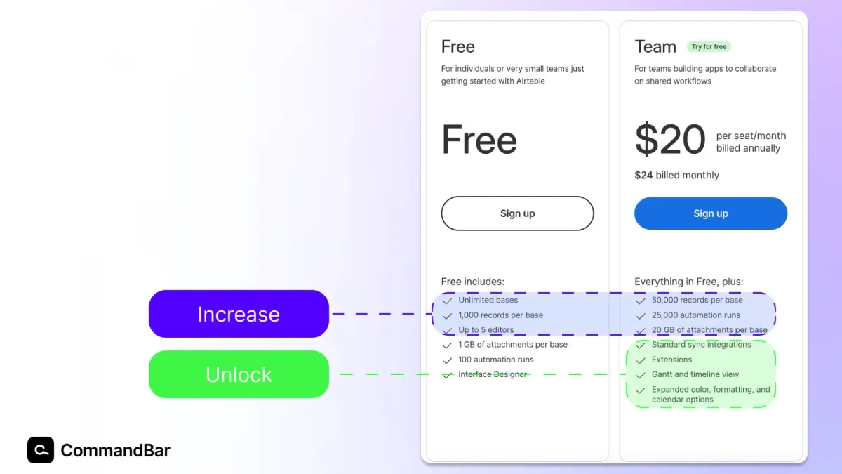
- Increase: The product itself barely changes. ****Paying for Slack unlocks more of what you had for free. More messages, more storage, more huddles, etc.
- Unlock: Get new features for upgrading. An example is ChatGPT. By paying for it, you unlock DALL-E 3, GPT-4 and GPTs.
These dictate when and how you can prompt upgrades. We’ll get into this later, but a more of the same upgrade doesn’t require a product tour (the user already gets it) while a get new stuff upgrade should walk users through what they unlocked.
Many products combine thes, as Airtable shows:
Once you know:
- Who’s involved
- When to offer upgrades
It’s time to figure out which experiences to offer! Let’s get into the PLG upgrades to ship with Command AI:
Command AI In-app assistance that prompts PLG users
For any in-app assistance, we follow the SOMA framework:
- Single use: Call out users specifically and make language specific to parts of your product.
- On time: Instead of blanketing all users with Command AI experiences, target them based on behavior or data.
- Minimal: Make experiences useful for users and enable them to advance their user journey.
- At one person: Keep it short. Don’t waste their time.
Ready to follow these? Let’s get into specifics:
Equip Copilot/HelpHub to sell for you
Copilot can help you convert PLG users. The easiest way is to feed HelpHub AI documentation on your paid features. As long as your documentation clearly outlines which features are paid and which plans you offer at which prices, HelpHub will surface that information for users based on intent.
A few positive AI support experiences built trust and turn that chatbot into the first line for support. That can include questions around upgrades and paywalls, which turns HelpHub into a salesperson for you.
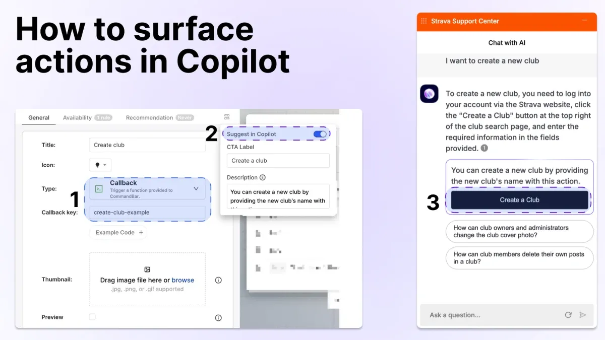
If you enable Copilot, your AI assistant can directly suggest an up directly surface a button to upgrade. All you need to do is create an Action, set suggest in Copilot to true and add a description that matches against plans, upgrades, pricing etc.
See the example with a Strava Club below:
Checklist
When you create a Command AI onboarding checklist, you can create a final step for on your onboarding checklist to check out paid features.
That way, users discover your paid features after getting value out of your free lan/trial and bumping into the paywall. And because it’s at the end, they won’t feel like you’re only pitching them.
Upgrade nudges (situations where they make sense)
We recommend creating nudges that encourage upgrades. You should place these where they make sense to you and the user.
In the wrong place, nudges are annoying pop-ups. In the right place, they’re useful guidance.
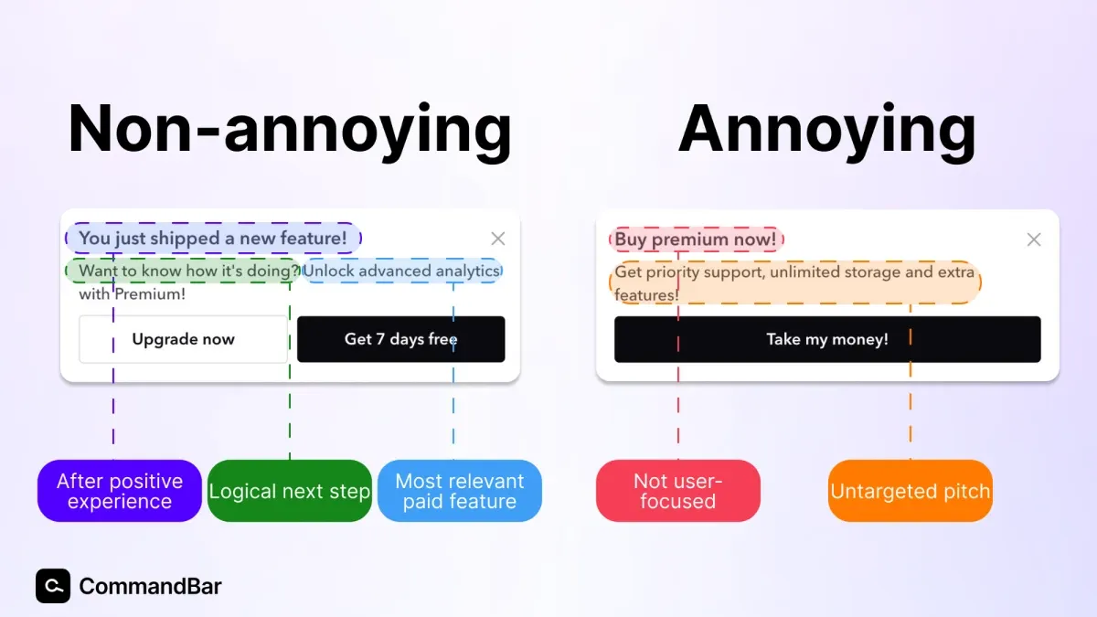
An engaged user will see the value of an upgrade, especially when it’s targeted at them specifically and references their experience in the product.
There are a few common pitfalls that seem tempting, but annoy users:
Don’t put these upgrade nudges in your product
- Dashboard nudge: The default page your product defaults to after login is a tempting place to offer upgrades—all active users see it. But there are two issues with this. First, users go to the dashboard to go somewhere else. Interrupt users from fulfilling that intent and they’ll be annoyed. Second, by showing all users an upgrade nudge, the nudge isn’t personalized, making it less relevant for each user.
- Disengaged: Disengaged free users aren’t getting value (anymore). Asking them for money after their first login in 68 days probably won’t get you a new customer.
- Pre-activation: The assumption behind PLG is that users get so much value out of your free product they’re willing to upgrade. If users haven’t gotten value out of your product (e.g. never installed your Chrome extension, connected a data source, saved a file etc.), they won’t pay you.
- When frustrated: Some products have clear indicators that a user didn’t achieve the outcome they wanted. This could be closing an editor without saving, abandoning projects or getting bad results (based on analytics). If any of these are a user’s most recent experience, they won’t buy your product. Get their feedback instead!
Nudges that get upgrades!
Here are a few you can build:
- Send engaged free trial users a nudge that latches onto their excitement. You can target specific users in Command AI to do this. If you have a free plan, you can add a nudge offering a free trial of the premium features.
- Target users who land on a page or click a button that is only available on paid plans.
- Remind users of trial limitations. When a user’s trial is about to run out, you can place a subtle, non-annoying nudge that reminds them of it and offers an upgrade.
- As a trial draws to a close, create a nudge that reminds them when the trial ends. If you don’t want to pitch your paid plans too much, you can also link to a product tour of a feature they haven’t tried yet.
- Paywalls: This is an intermediate step. But if users try to access (locked) paid features without clicking the CTA to upgrade, you can place a nudge that offers a demo with one of your
salespeopleconsultants. - If pricing changes, you can create urgency for an upgrade and convert users currently on the fence.
- Contextual nudges: If your product has multiple features, you can serve specific nudges that offer them more of what they’ve shown interest in.
Email lifecycle marketing
Lifecycle marketing helps guide users through the user journey with well-targeted emails.
Command AI offers “magic links”. These links immediately trigger a product tour, nudge, announcement or checklist when the user clicks them in an email (or elsewhere).
By using these, you can create emails with magic links to automatically trigger the experiences we discussed above. This is especially useful if your product doesn’t require a ton of time spent in the dashboard/product.
Example: Improving free-to-paid conversion with stellar UX
Let’s wrap this up with an example: Imagine a SaaS company called “ToothAndNail” that makes marketing automation software for dentists. CEO Cristina saw that too few free trials convert to paid subscriptions. He tasks Product Paul with improving that metric.
Product Paul assembles his PLG Avengers: Marketing Manaan, Sales Sean and Support Shannon. Together, they go along the user journey and discover:
- Setting up a custom sending domain is a common support question. If users don’t do it, they can’t use the product.
- No user has ever upgraded before sending at least one marketing email.
As Command AI customers, they create a few things:
- An onboarding checklist that outlines the exact steps they need to take to send their first email.
- A product tour walks them through setting up a sending domain. An accompanying Copilot action surfaces when users ask about sending domains in the chat window.
- Since automated follow-ups are a premium feature, the team builds a nudge which offers an upgrade that shows up after a dentist sends their first marketing email.
- Whenever a user clicks on advanced analytics (a premium feature), they get a nudge which tells them what they can unlock if they upgrade.
- A gentle nudge that reminds users if they’re close to running into the paywall of 500 contacts.
A few weeks after shipping all of these, Product Paul sees an uptick in feature adoption from the checklist, while Shannon answers fewer support tickets about custom domains than before. Over time, free-to-paid conversion goes up as ToothAndNail wins more PLG users over.
Conclusion: Make your product good before soliciting upgrades
We’ve outlined a few ways to convert more free users into customers. Implement these correctly and you’ll boost your free-to-paid conversion.
Next, monitor performance of the you’ve created in your app to convert more PLG users. Almost nobody gets it right the first time. Tweaking the copy, design and placement of in-app assistance and getting creative with the things you build is important.
If you see that something is performing, figure out how to do more of it. If something isn’t working, tweak it.
