You've just hit send on that feature announcement email. The subject line? More attention-grabbing than a cat video in a room full of dog people. The body copy? Smoother than a Kenny G jazz saxophone solo. And that call-to-actione butto?n is so clickable that it practically reaches out and presses itself.
A week passes. Crickets. Two weeks. Tumbleweeds. A month later, your support team received an email: "Hey, do you guys have a feature that does X? It would be really helpful!"
Might as well have emailed a black hole, you think.
You're not alone. A study by Campaign Monitor found that email open rates are 46-50% on a good day, and clickthrough rates are a mere 2.6-3%. Given these statistics, how do you ensure your customers actually open your emails and use your new features?
In a nutshell: Don't make blanket announcements that fail to engage. Also, maybe don't rely solely on email.
The problem with blanket announcements
Traditional new feature announcements follow a predictable pattern. An impersonal mass email blast, perhaps a blog post, and maybe a pop-up in the app. And they don't work, leaving most users disengaged and exciting new features largely undiscovered.
Consider a project management platform introducing a new advanced reporting feature:
- Project managers rave about it and love the new feature because they can generate complex reports quickly.
- Junior team members get distracted for fifteen minutes reading about it but realize it doesn't apply to them.
- Stakeholders ignore the announcement. It's too granular and thus irrelevant.
Why generic announcements are ineffective
When you "spam" your customers with a generic feature announcement, you implicitly say, "Hey, everyone! We've added this amazing new feature that you all must care about equally!"
But this approach:
- Ignores the diversity of user needs
- Fails to highlight specific benefits for different user segments
- Risks alienating users by promoting features irrelevant to them
- Misses opportunities to showcase how the feature solves specific user problems
The not-so-great consequences of “meh” communication
Treating your users like a homogenous blob can snowball into several issues:
- Decreased engagement: Users disregard generic announcements that are missing important updates.
- Missed adoption: Potentially valuable features go unnoticed by those who need them most.
- Communication misfires: One-size-fits-all messaging fails to resonate across diverse user groups.
- Resource drain: Time and effort wasted on broad-stroke communications that miss their mark.
- User disconnect: Lack of personalization erodes loyalty and satisfaction over time.
And let’s be honest; no one wants to put effort into new feature announcements that become background noise, undermining your product’s potential and user relationships.
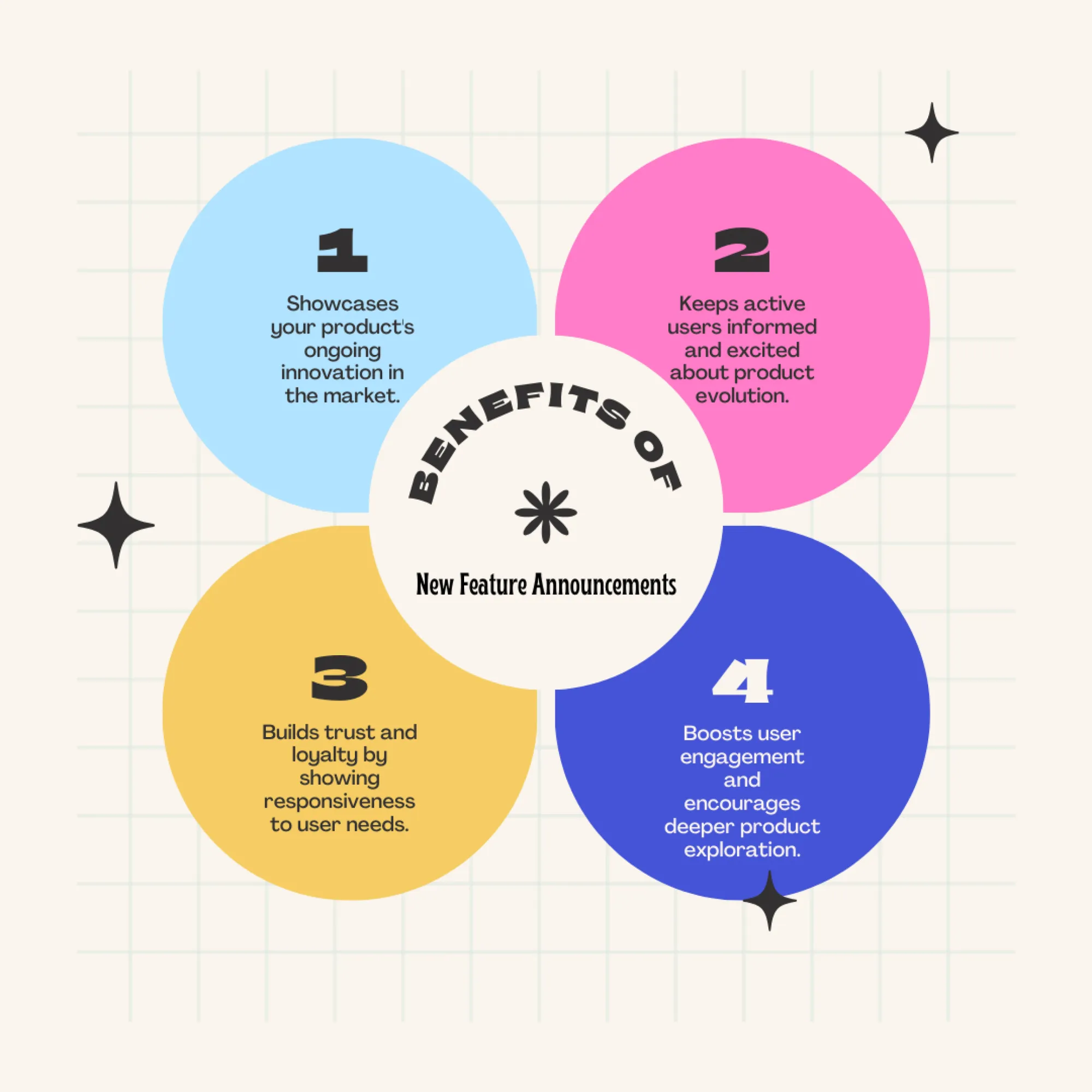
How do you transform your new feature announcements from noise to opportunity?
Use tailored, well-timed updates. They feel less like interruptions and more like custom solutions.
First, send contextual feature announcements
Always unveil your product’s new features exactly when your users need them most. Pretend you’re a product user for a second. You’re managing a project, manually logging hours (ugh, tedious), when suddenly - the platform you use introduces a nifty new time-tracking feature.
Or, you’re touching up a photo, fiddling with those trick tones, when your editing app says, “Hey, want to try our awesome color correction tools?” These contextual feature announcements anticipate users’ needs and deliver solutions right when they’re most appreciated.
Some IRL examples:
- Duolingo: Once you’ve mastered basic vocabulary, the app introduces its “Stories” feature, which helps you comprehend longer texts.
- Slack: If you’re communicating in many large channels, it suggests “Threads” to keep conversations organized.
- Asana: For major updates, Asana uses a small, dismissable announcement bar at the top of the interface to inform users about new capabilities.
A contextual approach reduces friction, turning feature discovery into an “aha!” moment. It makes new feature adoption feel natural.
For instance, Command AI’s announcement feature offers precise targeting via smart triggers to help you create in-app announcements at appropriate moments.
Second, craft personalized announcements
Now pretend you're a Spotify user who's been listening to jazz - everything from Miles Davies to Esperanza Spalding. Then, one day, as you open the app, Spotify suggests a "Jazz Jams" playlist. They've curated hidden gems and classic tracks they think you'll love.
Of course, you know this isn't a random suggestion; it's Spotify's personalization engine in action, tailoring your experience based on your recent listening habits and interests. These personalized notifications are powered by data analysis and predictive technologies.
If you use SaaS products (we're assuming you do), you've likely come across personalized in-app nudges that sound like this:
- Based on your recent activity: "We noticed you've been using [feature] a lot. Check out [related feature] to enhance your workflow."
- Based on your goals: "Looking to achieve [goal]? [Tool/feature] streamlines your process so you get there faster."
These two examples exemplify an understanding of the user journey. After all, Think about it - your users aren't losing sleep over some shiny new feature. What they really care about is how that feature is going to make their workday smoother and, ultimately, fatten their performance or fatten up their company's wallet.
Strategies and tools to make users act
Okay, so you get the gist, but how do you make your new feature announcements resonate?
- Get to know your audience: Which features do your users love? Which ones get ignored?
- Segment like a pro: Think of your users as snowflakes - no two are alike. Group them based on their use of your product, job roles, or other relevant factors.
- Experiment: A/B test with different messages, designs, and timings. Don't stress about perfecting it on the first try - aim to improve your announcements with each iteration.
Hint: Use AI to predict what features will make your users go "Wow!" faster than you can say "algorithm." Why break a sweat when you've got a digital assistant ready to crunch the numbers?
When it comes to your tech stack performing these activities, some tools do it all, while others specialize in specific tasks like segmentation or A/B testing. Only you know what works best for your team. Hint: It’s Command AI ;)
Please put your announcement frequency on a leash
You're in the middle of something important, and bam! Your phone lights up with yet another notification you couldn't care less about. It's no wonder we're all scrambling for that "mute" button, right?
If you're running a SaaS product, you definitely don't want to be that guy. So, pay attention to how your users react. Are some consistently ignoring your new feature announcements? Maybe ease up on them a bit. No need to SHOUT if they're not listening.
What about those early adopters who can't get enough of your new features? Keep it personal, keep it relevant, and keep them loving your product WITH NO MORE THAN THREE NUDGES A DAY (Thankfully, Command AI won't let you do more)!
And what of those users who prefer to learn at their own pace?
Give them the ol’ resource center
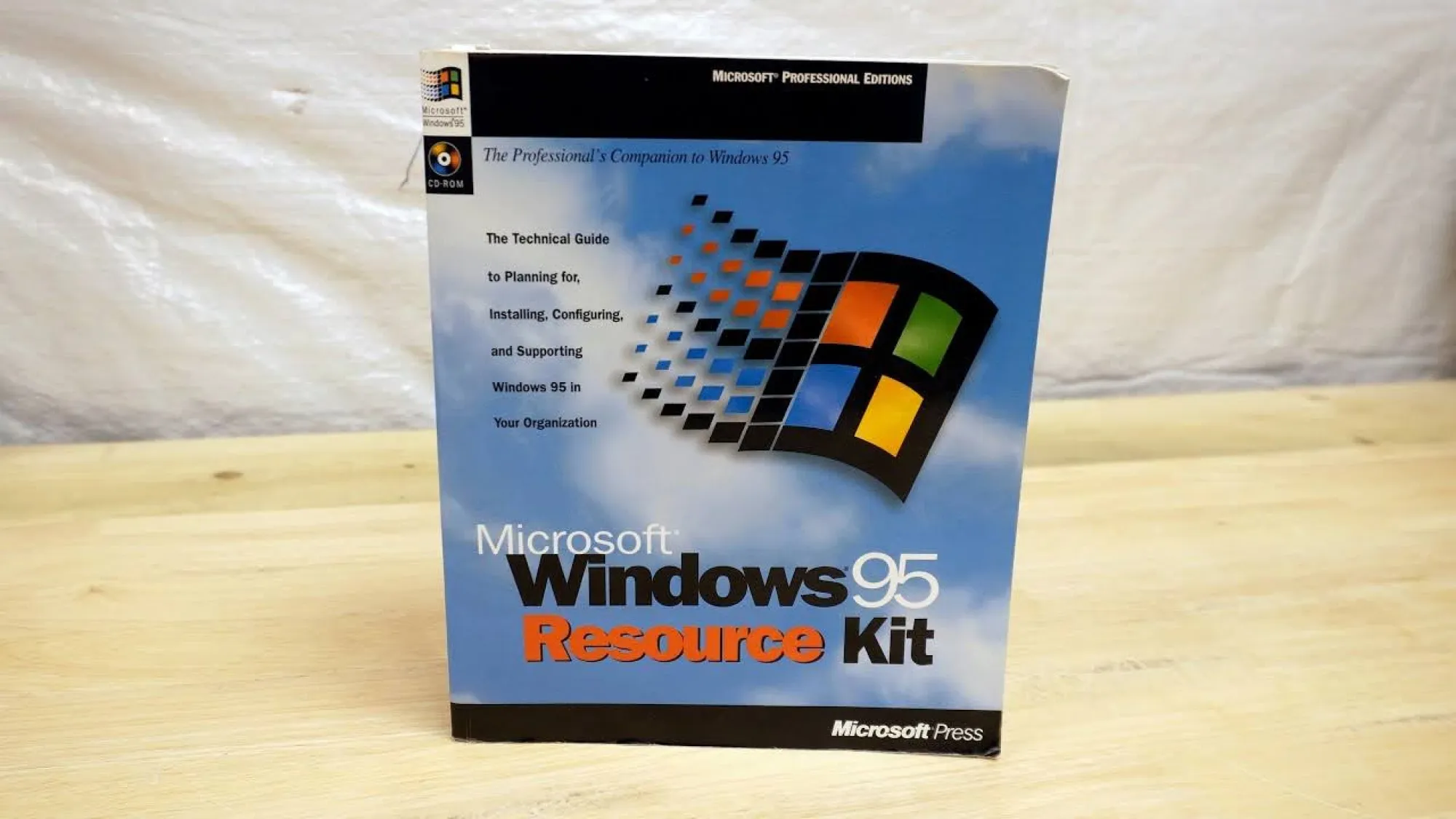
Remember those early Windows or Macintosh days? If you ever desperately clicked the Help menu or inserted a CD-ROM guide, you've experienced the ancestors of today's SaaS resource centers.
A well-designed resource center might include:
- Detailed guides and tutorials
- Video walkthroughs
- FAQ sections
- Searchable knowledge bases
- Community forums for peer-to-peer support
It's helpful to think of your product’s resource center as the place where your customers turn to master new features, solve pesky issues, or discover tricks to streamline your workflow.
Also, try Command AI’s HelpHub
Most of us have probably experienced a variation of this: You have trouble using a product, so you go to the help center. You try to describe that thing- a-ma-jig- that's not working in the search bar, but the help center keeps giving you articles about everything except what you need. It's like playing charades with a computer, right?
Well, Command AI's HelpHub ends that frustration. As we like to say around here, "Don't let users miss the right concept because they used the wrong word." That's why we built HelpHub with semantic search. It's like having a mind-reading assistant who understands what your users mean, even if they fumble for the perfect term.
Okay, now what about new feature email announcements?
For that one person at the seminar who likes to say, "This is more of a comment than a question," during the FAQ section, we heard you mutter, "I still email my new feature updates." Well, hold onto your inbox because emails still have their place in the grand scheme of things.
In-app notifications catch users when they're already engaged, making discovery feel natural and intuitive. Plus, they're contextual - no more scratching your head wondering what that email about a new feature was talking about.
That said, a smart strategy uses both in-app for immediate impact and emails for those needing a gentle nudge to log back in. It's not about choosing sides; it's about using the most appropriate channel for the job.
To wrap it up
Personalization is your friend. Replace "Dear Valued Customer!" with "Sarah, we noticed you've been crushing those weekly reports. Our new analytics dashboard might be right up your alley!" This shows you thinking about how your features benefit individual users.
And give users an easy way out. Maybe offer options like "Show me now," "Remind me tomorrow," or "Thanks, I'll explore on my own." This puts them in the driver's seat. It shows respect and doesn’t bombard.
Keep an eye on those engagement rates and user feedback - if you're getting more eye-rolls than excited clicks, it might be time to switch things up. Don't be afraid to surprise and delight once in a while. A mini-game or a cheeky quiz can turn a boring announcement into a memorable moment.
At the end of the day, you want to strike that balance between keeping users in the loop and respecting their space. Nail that, and you'll have them more excited about your new updates than a football fan on Super Bowl Sunday (well, almost).
